Alright folks, today I figured I’d try something different. Been seeing Ansel Adams’s epic mountain shots everywhere – like, those crisp black and white photos that look unreal? Yeah, those. Thought I’d see if I could, you know, maybe understand why they hit so different. Turns out, just staring at them wasn’t cutting it. So here’s me fumbling through it, step by step.
Starting Totally Lost
First, I grabbed one of his most famous shots – “Moonrise, Hernandez, New Mexico”. Printed out a decent-sized copy, plonked it on my desk. Honestly? At first glance, it just looked like a very nice, very detailed black and white photo. Kinda moody, sure, but I wasn’t getting the big deal. Needed to look much harder.
Trying (and Failing) to Copy It
Thought maybe the trick was the gear. People go on about his massive cameras, right? Well, I ain’t got one of those. So I took my digital SLR out to the biggest, most dramatic landscape I could find near me – honestly, it’s just some hills, nothing like Yosemite. Tried framing shots with big skies, stark trees… aimed for that high contrast, super-detailed look. Took hundreds of photos! Back home, slapped them into my editing software. Cranked contrast, sharpness, messed with blacks and whites…
Result? Mostly looked like harsh, over-processed garbage. Muddy blacks, blown-out whites, no smooth transitions. Nothing like the depth and feeling in his work. Got frustrated. Closed the laptop hard. Maybe it’s not the slider settings?
-
What didn’t work then?
- Blindly copying camera angles.
- Just cranking every ‘dramatic’ setting in editing.
- Thinking gear was the main factor.
Actually Reading What He Said
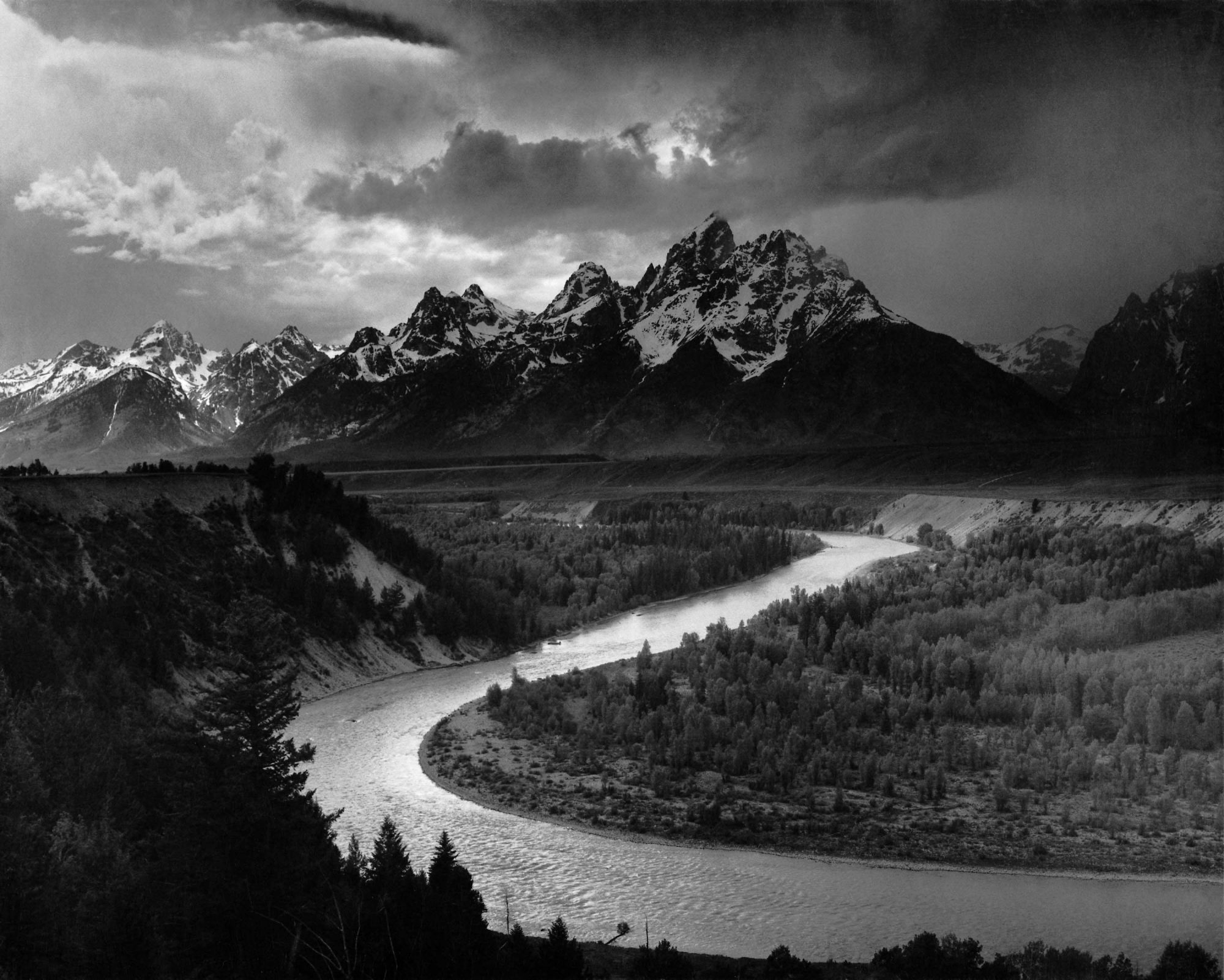
Feeling stuck, I did the obvious thing I should have started with: looked up what Adams himself actually talked about. Kept seeing this phrase over and over: “The Zone System.” Sounded super technical and intimidating. Found some simpler explanations. Basically, it wasn’t just taking the picture; it was previsualizing exactly how the final print should look before clicking the shutter. He divided brightness into zones, from pure black (Zone 0) to pure white (Zone X). His magic was placing every single element in the scene into the exact brightness zone he wanted it to be in the final print, through careful exposure and development.
Lightbulb moment! He wasn’t just capturing a scene; he was designing the light and shadow meticulously. My ‘crank the contrast’ approach was the exact opposite of that control.
Looking Again, with New Eyes
Went back to “Moonrise”. Tired this time, stared at those zones. Started spotting them: the deep black sky (Zone I or II?), the bright, textured clouds (maybe Zone VIII?), the moon itself (pure white, Zone X?), the graveyard markers glowing (Zone VI or VII?), the darker landscape (Zone III?). It wasn’t random high contrast; it was carefully orchestrated tones, each part singing its note in the brightness choir. The drama came from the range and the control – deep blacks holding detail, bright whites not just blowing out, and smooth steps in between. HUGE difference from my muddy edits.
My Basic Zone Attempt
Feeling slightly braver (and humbler), I picked a simpler subject: a row of old books on a shelf near a window. Natural light. Before raising the camera, I actually tried to think like Adams might. Asked myself:
What’s the darkest thing I want to see detail in? (Deep shadows between books.)
What’s the brightest important highlight? (The edge of a worn cover catching light.)
Took a light meter reading off the mid-grey book spine (Zone V). Adjusted my exposure manually to place that highlight where I wanted it, knowing the shadows might fall lower. Took the shot. Only slight adjustments in editing – mostly just placing the tones where I’d roughly previsualized them. It wasn’t Ansel Adams, obviously. But… it felt deliberate. The books had weight, texture. The light felt controlled, not accidental. It was the first photo in this experiment that didn’t make me cringe.
Key Thing I Learned? It’s About Mindset, Not Magic
Turns out, getting anywhere near Adams’ style isn’t about fancy buttons or Instagram filters. It starts before you click. That whole “previsualize” thing? It’s everything. You gotta see the final black and white image, the zones, in your head first.
If you just snap away hoping editing will save it (like I did!), you’ll fail. You need to actively place tones while shooting. His quote “The negative is the score, the print is the performance” finally made sense. The exposure/development control is part of the craft.
Adams wasn’t just lucky with light; he understood it deeply and bent it to his will, step-by-step, from scene to film to final print. That’s the core takeaway I got from wrestling with this. Don’t try to be Ansel Adams in one afternoon. Just try thinking about light in zones next time. It’s a game-changer.