So today I decided to dig into this whole colorito vs disegno thing. Honestly, the names alone made my eyes glaze over at first. But I kept seeing it pop up in art stuff, so I figured, why not? Gotta understand what the fuss was about.
Where I Started: Totally Lost
My first stop was just typing it into a search engine. Big mistake. Page after page filled with fancy art history terms and long names I couldn’t pronounce. Words like “Cinquecento” and “Mannerism” started swimming before my eyes. Felt like I needed a PhD just to read the first paragraph! Closed that tab real fast.
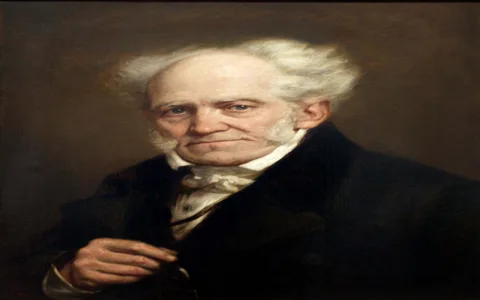
I needed a simpler angle. Maybe forget the fancy words and just figure out what the core argument was. Tried searching for “simple explanation colorito disegno”. Still kinda messy, but better. Kept seeing mentions of Michelangelo and Titian, those guys I kinda know.
Breaking Down the Big Words
Okay, time to translate this jargon into English:
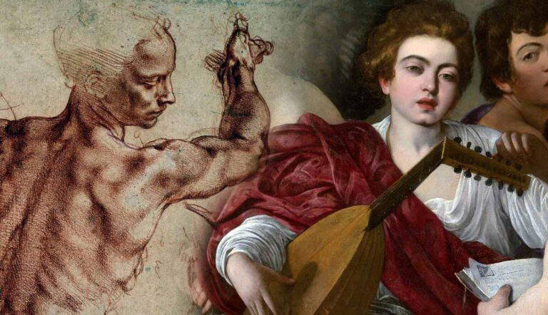
- Disegno: Seemed to mean drawing or design. Basically the bones, the structure, the outline. Like, getting the proportions and shape super accurate first. Think precise pencil sketches.
- Colorito: This one was about color and painting. Less about perfect lines, more about the mood, the feeling, how you use paint and light right on the canvas. Like blending colours directly to make things look alive.
Already, that felt way clearer. Two different ways of thinking about making art.
The Rivalry Part
Digging a bit deeper (still avoiding the super academic stuff!), the real drama became clearer. It wasn’t just different styles; it was like two rival schools dissing each other centuries ago!
- The Florence crowd (think Michelangelo) were the big disegno fans. They believed mastering drawing was the absolute foundation. Everything starts with perfect line and form. Color? Important, but secondary.
- The Venice crew (with Titian as a star) pushed colorito hard. They were like, “Forget strict drawing, focus on the color! Capture the light, the atmosphere!” Their work often looked softer, more immediate, like the painter built the whole picture with color.
So the big historical “debate” was basically these two powerhouse art cities arguing about which approach was the real heart of genius: perfect drawing foundation or masterful color application? It was style, philosophy, and probably a bit of regional pride all mixed together!
The Point That Clicked For Me
The lightbulb moment was realizing it wasn’t about one being definitively better (though they argued it was!). It’s about different priorities, different starting points.
- Need a super accurate, perfectly proportioned figure with amazing detail? You lean disegno heavy.
- Want to capture the shimmering light on water or a person’s flushed cheek? That’s where colorito techniques shine.
Most great artists actually use both skills! But back then, artists and writers felt like they had to pick a side. It was this big theoretical battle about the soul of art itself. Makes more sense when you strip away the intimidating names and see it as just two fundamental tools in the artist’s toolbox.
So yeah, colorito vs disegno: It’s basically the Renaissance version of a classic art school argument – do you start with perfect pencil lines or jump straight into the paint? Different cities, different masters, different vibes. Understanding that simple core made the whole historical debate way less mysterious. Phew!