Okay guys, so this whole Alma Thomas art thing popped up on my feed again the other day. You know, those colorful, kinda mosaic-looking paintings? People kept saying they were joyful and rhythmic, but honestly, I just saw a bunch of colored dots and dashes. Decided enough was enough – time to actually try and figure out what the big deal was myself, using some super basic steps I found. Here’s exactly what I did, step-by-step, no fancy art talk, promise.
Step 1: Gathering Stuff & Feeling Clueless
First things first, needed supplies. Wasn’t gonna invest big bucks on something I might totally bomb at. Rummaged through an old drawer:
- A pad of that cheap kid’s watercolor paper – figured thicker paper might hold paint better.
- A basic watercolor set my niece left behind (the little pan kind with a brush attached).
- Some leftover acrylic paint tubes from a failed home project.
- My only brush: a ratty old flat brush that was shedding bristles.
- A plastic cup for water. Fancy.
Got everything laid out on the kitchen table. Looked at a picture of Alma Thomas’s “Red Rose Sonata” on my phone. Felt zero rhythm, just a sea of pinkish bits. Sighed.
Step 2: Playing With Just Color Blobs
The advice said: ignore the shapes at first. Just think color. Okay… Grabbed the red rose picture again. Tried mixing on the crappy watercolor palette. Wanted a soft pink. Ended up with muddled peach? Ugh. Dipped the shedding brush into my mix, dabbed it on the paper. Made a watery, blotchy mark. Repeated this, trying different combinations from the screen:
- Scooped some yellow acrylic, mixed with water (probably too much), made a thin sunshine smear.
- Dabbed some pure blue watercolor straight from the pan – left a thick, grainy blob.
- Mixed a tiny bit of white acrylic into some red, got a dusty pink.
Looked at my page: just random, kinda ugly splotches. But… focused only on how the colors looked next to each other. That soft pink next to the vibrant blue? Weirdly… nice? Like sunlight through stained glass? Huh. Maybe? Kept going for ten minutes, no pressure.
Step 3: Attempting the Patches (Chaos)
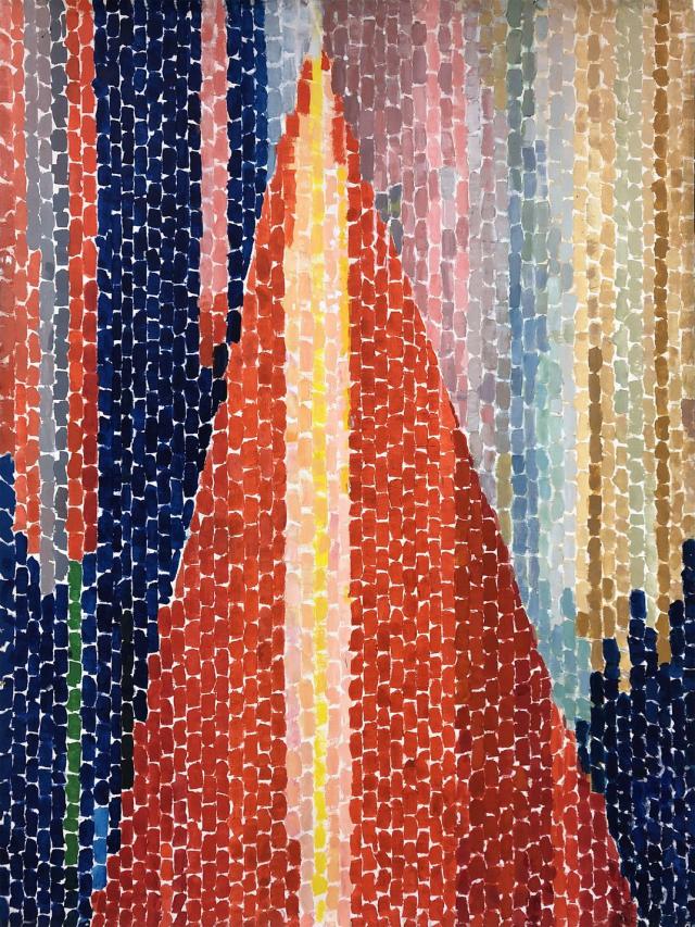
Right, step three: notice those patches or strokes. Looked at the picture – her stuff looked like tesserae? Like little tiles. Okay. So I needed to make small marks consistently. With my shedding brush. Brilliant.
Loaded the brush with that dusty pink mix. Tried to make a neat little rectangle. Pressed down: paint bled everywhere, became a fuzzy oval. Tried again, lighter touch: got a watery ghost of a dash. Switched to the acrylic – thicker, better. Dipped the corner of the brush into some strong yellow. Tapped it: tiny flat mark! Yes! Started making little taps: tap-tap-tap with yellow. Then switched colors, tap-tap-tap with blue nearby. Wasn’t neat, wasn’t planned. My dots looked lumpy, my dashes uneven. But the rhythm part started making sense – it was just the repetitive action, over and over.
Step 4: Letting Things “Arrive” (Not Overthinking)
I was concentrating so hard on these ugly little marks, trying to force order. Then I remembered the point: Don’t try to control it totally. Her work feels alive partly because it’s not rigid. Stopped trying to make perfect rows. Just tapped colors roughly where I felt like it. Added a cluster of green streaks near the top. Threw in a few bigger, random reddish marks because I had leftover paint on the brush. Looked at the mess. Stepped back. Okay, it wasn’t “pretty,” but stepping away for a second, it stopped looking like a disaster. The colors started buzzing together. The random groupings? They kinda… worked? Maybe that’s the “joy” people talk about – the energy comes from the variety within the repetition. Mind slightly blown.
Step 5: Giving It a Meaning (Or Not)
Final step: assigning meaning. This felt weird. I just made abstract blobs! But I looked hard at my messy page. What did it remind me of? Honestly? First thought: summer sidewalk reflecting the sun – patches of heat, maybe shadows from trees? Mostly, just the feeling of bright light warming my face. Was that it? Who knows! But the key thing is I thought it could be something natural, something about light. It didn’t have to be “Red Rose Sonata.” It could be “Patio Heatwave Feeling.” Or nothing specific! But just thinking “this could be light” made the whole process click. Before, it was random colors; now, it felt intentional, like capturing light with paint blobs.
What Actually Happened After
I didn’t magically become an art critic. But I get it now. Doing those steps – messing with color, feeling the rhythm of the brush taps, letting it be loose, and thinking “light” – totally changed how I see her work. Before, it was wallpaper. Now, I see the energy, the celebration of color itself as the subject. It’s not about painting a thing, it’s about painting light using these little mosaic-like gestures. My version was super scrappy, used awful materials, and looked like a kid’s project gone wrong. But doing it was the key. Felt way less intimidating afterwards. If I can kinda sorta understand it with a shedding brush and cheap paint, anyone can. Just grab stuff and give it a messy try!