Man, let me tell you about this week’s rabbit hole. I usually stick to modern tech problems, but history, specifically the really messy stuff, sometimes just grabs you by the throat. This whole Carolingian Empire thing—Charlemagne was easy. Big empire, big guy. Then BAM, he dies, and everything turns into a massive, complicated family fight over the inheritance. The Treaty of Verdun in 843? It’s arguably the most important political partition in Western history that nobody actually visualizes correctly. Every textbook map looks like it was drawn by a drunk guy with three colors, and it never truly explains why this split guaranteed a thousand years of border conflict.
The Spark: Why I Had to Build My Own Map
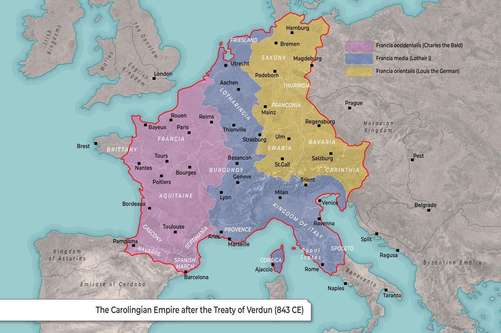
I was watching this historical piece, and they flashed a map of the 843 partition for maybe three seconds. Three seconds! My brain couldn’t process who got what. Louis the German? Charles the Bald? And Lothair—the guy who got the weird, skinny middle slice that was geographically impossible to defend? I paused the video, zoomed in, and the borders were blurry, inconsistent, and seemed to ignore actual geography. That’s when I decided I had to build my own damn visualization. Not just a pretty picture, but a functional resource map that instantly showed why this division guaranteed perpetual fighting between the regions that would become France and Germany.
My core goal was speed of understanding. I needed a visualization where the logic—or lack thereof—of the three kingdoms (West Francia, East Francia, and Middle Francia) was brutally clear. I wasn’t going to rely on someone else’s fuzzy academic interpretation. I had to dig up the primary source descriptions myself and apply them to a modern topography.
The Grind: Wading Through 9th-Century Geography
First step, I scraped together everything I could find. I tried the easy route—downloading existing maps and stitching them together. Disaster. The border lines never aligned, especially where Lothair’s bizarre middle kingdom (Lotharingia) met the western part. I realized quickly that relying on modern maps that smooth over the inconsistencies was useless. I had to go back to the source descriptions—the actual geographical markers they used in the 9th century. Rivers, mostly. The Scheldt, the Meuse, the Saône, the Rhône. You have to remember, they weren’t using clean lines; they were often using natural landmarks, which are open to interpretation.
I structured my process into four distinct data-gathering stages:
- I started by overlaying a modern elevation map. This was absolutely critical. You can’t understand the division if you don’t see the massive barrier of the Alps, the navigable nature of the Rhine valley, and the rugged terrain of the Massif Central clearly. The map had to feel physical.
- I wrestled hard with Lothair’s territory. It stretched from the North Sea all the way down to Italy. This wasn’t a logical state; it was a compromise designed to give Lothair, the senior emperor, the major imperial cities (Rome and Aachen). I had to manually trace that skinny spine, making sure I included Aachen (Charlemagne’s old capital) right in the middle, which was the political point of the whole exercise.
- I confirmed the major river boundaries. The Treaty used the rivers as literal dividers. I had to cross-reference academic texts that detailed which bank of the river belonged to which brother. The line along the Rhône was particularly tricky, as the western side went to Charles and the eastern side to Lothair.
- I looked at the diocesan maps. In that era, the church boundaries often dictated political influence, especially in the fuzzier transition zones. I pulled up old episcopal maps and cross-referenced them with the treaty text summaries. That’s how I finally locked down the critical line separating Charles’s territory (West Francia) from Lothair’s.
Execution and the Final Visualization
I ended up skipping fancy GIS tools. They were overkill and just complicated things. I needed something fast and direct. I fired up a simple vector drawing program. I took the modern topographic base layer, locked it down, and then I started painting the three areas: East Francia (Louis, using a strong red), West Francia (Charles, using a deep blue), and Middle Francia (Lothair, using a sharp yellow). No gradients, no fluff. Just flat, aggressive color blocks that scream “partition.”
The key was making sure the final resulting map didn’t look like some clean, modern border. The lines had to feel arbitrary, jagged, and violently imposed. That’s exactly what the Treaty of Verdun was: an arbitrary imposition by three powerful, squabbling brothers. I spent a solid eight hours just refining the boundary layers to ensure they felt historically faithful but visually jarring.
The Clarity of the Crisis
When I finally stepped back and looked at the finished map, it hit me. You can read a thousand pages about the failure of the Carolingian dynasty, but seeing that map laid out—that impossible, meandering, non-defensible middle kingdom assigned to Lothair—it explains everything fast. I drank an embarrassing amount of coffee trying to confirm the precise location of the border split just south of Lyon.
The final resource map shines a spotlight right on the inherent instability. Louis got the German core; Charles got the French core. Lothair got the buffer zone that everyone would fight over for centuries. It turns the whole convoluted agreement into one instantly digestible graphic. If you look at this resource map, you instantly see the seeds of future conflict. Next time someone asks about 843, I just slap this map down and the argument is over. It really proves that sometimes, the only way to truly understand complicated history is to stop reading and start drawing the lines yourself.


