Alright folks, today was one of those deep dives. You know, you see old buildings or fancy lamp designs, and you keep hearing “Art Nouveau” or “Art Deco,” but trying to spot the difference felt like squinting at blurry twins. Enough of that! I decided to seriously figure it out by just looking at tons of stuff side-by-side.
Where I Totally Messed Up At First
My first brilliant idea? Jump straight into heavy online articles. Big mistake. Fancy words flew everywhere – “stylized,” “organic motifs,” “machine age influence.” Crap. Felt like reading a textbook, and the pictures were all mixed up together. Couldn’t tell which fancy term went with which fancy curlicue. Closed those tabs fast. Totally confusing.
Time For The Real Work: Just Look
Okay, scratch that plan. Needed something simpler. I remembered seeing tons of pictures tagged on Pinterest and Instagram. Just search “Art Nouveau” and then “Art Deco“, separately this time, and just stare. Like, really stare at hundreds of pictures. Furniture, buildings, posters, jewelry – the whole deal.
What Slowly Started To Click
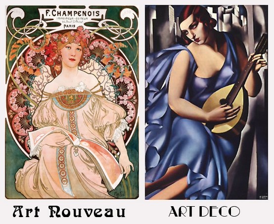
After scrolling forever, some patterns actually jumped out. Nouveau stuff? Looked kinda like nature exploded on it. Saw tons of:
-
Art Nouveau Stuff
- Lines that flow like water, twisty and bendy.
- Plants everywhere, but not real-looking ones – more like dreamy flowers, long stalks, lily pads, lady heads with crazy hair.
- Feel: Fairy tale, maybe a bit mystical?
-
Art Deco Stuff
- Sharp angles! Like triangles, ziggurats, straight lines ruling everything.
- Felt fast and modern, even the old stuff – think fancy cars and skyscrapers getting chrome-plated.
- Patterns repeating in bold blocks, sun rays pointing out, maybe a gazelle frozen mid-leap. More machine than forest.
- Feel: Jazz age party, rich people showing off their new gadgets.
Whoa. Seeing them separated like that made it way clearer than any article’s dense paragraph ever did. The curvy vs. pointy thing became obvious.
Making Some “Evidence” For My Brain
Just to really lock it in my head, I grabbed some public domain pictures everyone uses – you know the Nouveau subway entrances in Paris, those peacock posters, that Chrysler Building spire in New York. Made two simple collages side-by-side on my computer. Left side: All Nouveau swirls and flowers. Right side: All Deco ziggurats and speed lines. Seeing them right next to each other finally made it impossible to mix them up. The vibe is completely different! One feels like a magical forest drawing, the other looks like a blueprint for a 1930s rocket.
What I Actually Learned From Getting My Hands Dirty
Turns out the secret wasn’t memorizing definitions. It was just flooding my eyeballs with tons of images grouped correctly. Letting my brain notice the patterns. Once I saw ten Nouveau things in a row with all those soft curves and flowers, spotting a Deco piece suddenly felt jarring. Too sharp, too geometric. Flipped, Nouveau looked kinda frilly and soft next to Deco’s sharp edges. Seeing the difference wasn’t about thinking; it was about looking. My eyes figured it out way quicker than my head did by reading. Now I walk around spotting Deco skyscrapers vs. Nouveau lamps without needing to think too hard. Feels good to crack that visual code!