Man, let me tell you about my messy adventure digging into Henri Matisse’s wild Fauvist stuff. It all started when I stumbled across his name while surfing online art junk. Those colors looked crazy bright, almost wrong, and I was hooked. Needed to understand what the fuss was about.
Getting My Feet Wet
First thing, I grabbed my laptop and searched “Henri Matisse Fauvist paintings.” Boom, tons of stuff popped up. My eyes almost fell out looking at the colors. Total madness. I decided to pick eight that everyone seemed to talk about and figure out why they mattered.
Here’s how my digging went down, painting by crazy painting:
-
1. Woman with a Hat (1905)
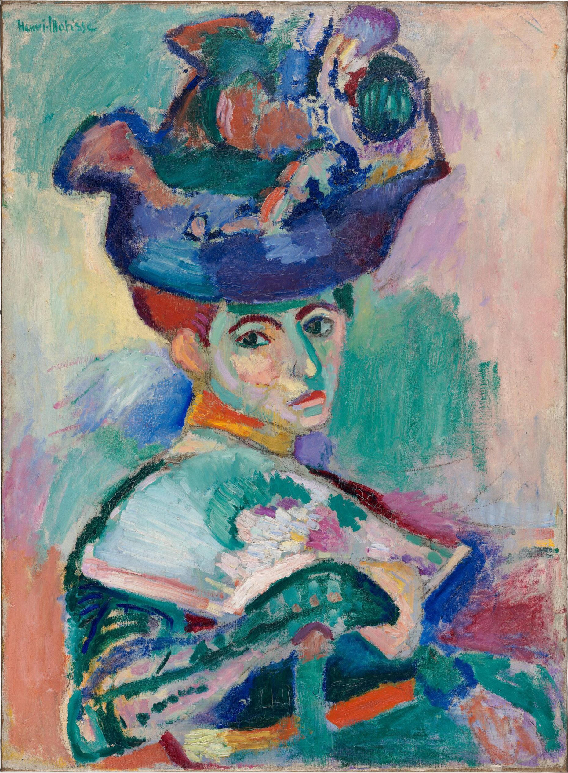
Saw this lady first. Her face? Greens, purples, straight-outta-the-tube kinda paint. Looked unfinished and rough. Tried sketching it myself. Made a total mess. That hat looked like a bird nest exploded. Realized Matisse wasn’t trying for pretty – this felt like throwing paint for the hell of it. Raw emotion.
2. The Joy of Life (1905-1906)
Next, this giant scene. Naked people chilling in a forest, all curves and insane pinks, oranges, blues. Seriously loud. I thought, “Let’s try drawing one of those figures.” Ended up with blobby stick people. The whole thing felt like music, not a picture. Pure freedom.
3. The Green Stripe (Madame Matisse) (1905)
His wife, but her face? Split down the middle by a big green stripe. Seriously? Shocking. Grabbed my watercolors, slapped some green on a selfie. Wife walked in, asked if I was sick. Nope! Just seeing how weird feels. Matisse broke every rule.
4. Open Window, Collioure (1905)
Pulled this one up – a view out a window. Flowers looked like they were on fire, bright reds and pinks. No boring “real” colors here. Grabbed my colored pencils. My window doodle looked like a kid’s drawing. Colors fought each other hard. Love that chaos.
5. Blue Nude (Souvenir de Biskra) (1907)
Found this famous blue lady. No attempt to look soft or round. Rough outlines, flat blue skin like a poster. Tried blocking in a figure with one blue crayon. Felt weirdly powerful. Simple shape, pure color – boom.
6. Harmony in Red / The Red Room (1908)
Whoa. A whole room drowning in RED. Tablecloth, walls – all screaming crimson. Pattern overload. Messed around with red paper and scraps. Glued ’em together. Looked like my table threw up. Totally overwhelming. Mad respect for pulling that off without burning your retinas.
7. Dance (I) (1909)
Circled back to this dancing ring later. Five figures grabbing hands, wild energy, crazy orange background. Bodies twisted like rubber bands. Tried drawing just one dancer’s pose. Cramped up like crazy. Pure movement on a flat canvas. How?
8. Bathers by a River (1909-1916)
Saved this beast. Started kinda Fauvist, ended up super weird and chopped up. Figures look carved out of stone. Felt cold after all that color. Scribbled some hard shapes in gray – gave up fast. Saw how he moved past just wild color later on.
The Messy Aftermath
Took a step back after that whirlwind. My notes were scribbles, my art attempts were disasters. But man, those eight? They’re like gut punches of pure color and feeling. Fauvism wasn’t about making things look “right.” It was about smacking you with how something feels. Makes sense why they caused riots back then.
Still can’t paint like that. Probably never will. But diving into those eight felt like getting shaken awake. Makes you see color totally different. Crazy.